CLIENT INDUSTRY
E-Commerce Web Development
PROJECT TYPE
Brand Strategy
Brand Design
Website Design
PROJECT PARTNERS
Web Development:
Kelly Vaughn
Kelly Vaughn came to me with an exciting problem to have: her business was growing too big. She needed to expand her workforce beyond just herself and she needed to put the message out there that she was ready to take on bigger, higher-paying jobs.
I interviewed Kelly’s past clients and learned that it was actually Kelly herself that made the transaction worthwhile. Her clients appreciated the warm and personal touches Kelly provided.
Armed with this info, we knew we needed to create something that had the sleek and high end feel of a big-time professional agency, but the warmth and softness that people had come to expect from Kelly. Using the valuable data from the customer interviews, we crafted a new name for Kelly’s business.

New name in hand, it was time to create something that visually represented these dual ideas: professionalism and friendliness.
Initial Logo Concepts

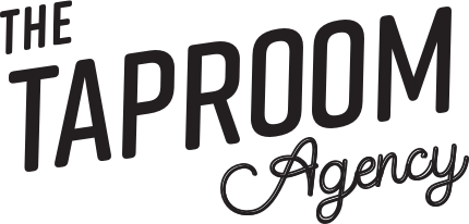
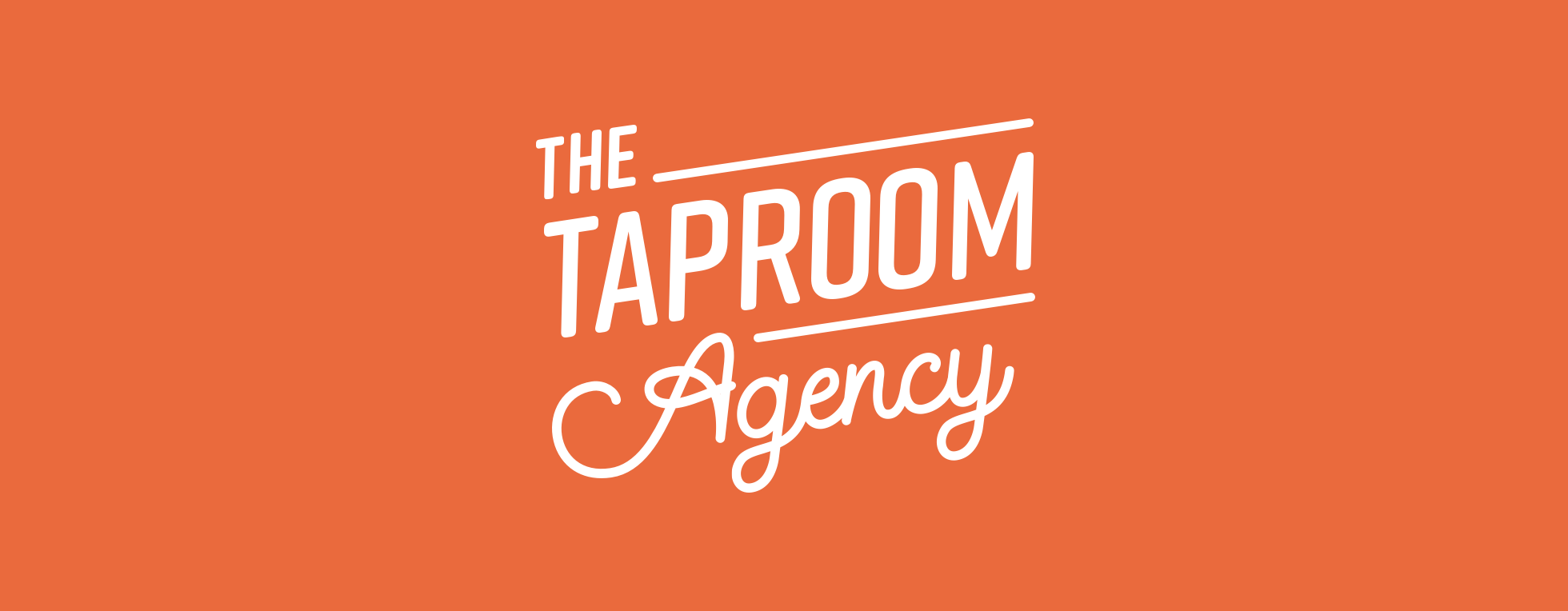
Ultimately Kelly chose the following concept. The upward diagonal slant of the mark makes it feel active and energetic, representing Kelly’s enthusiastic approach to her work. The primary typeface’s rounded edges and the presence of the script accent type give a human touch.
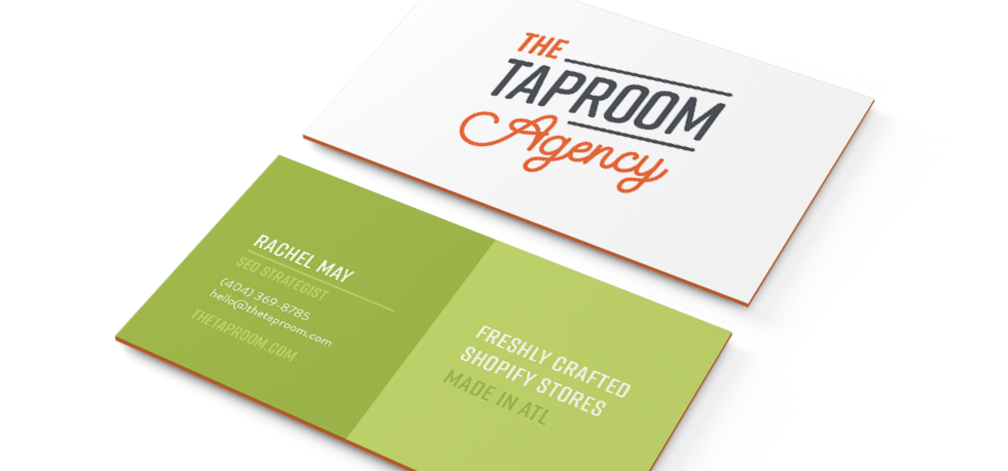
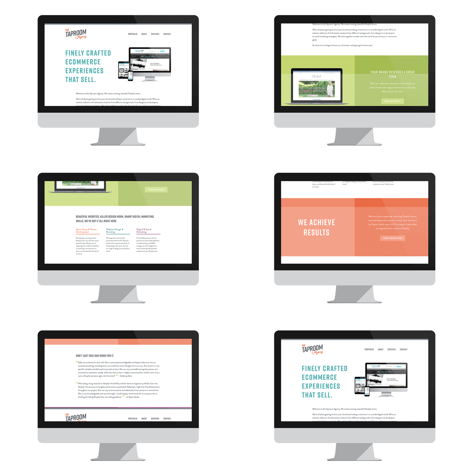
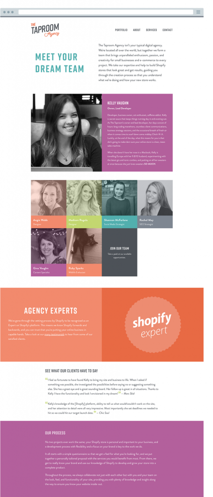
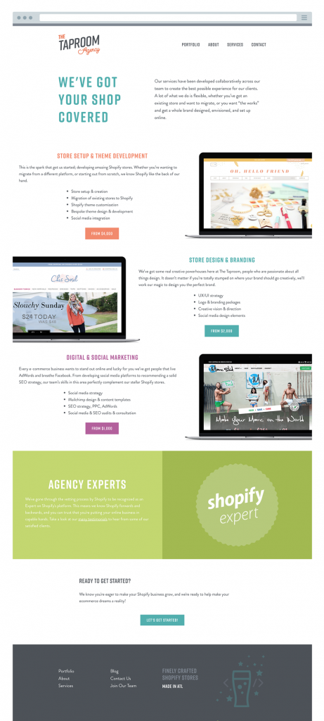
Based on our customer research, I helped Kelly whittle down the many ideas she had for her site into a simple and organized design that we knew would provide customers with the information they were seeking easily and conveniently, while also showing off Kelly’s immense skillset and exceptional work.
