CLIENT INDUSTRY
Financial Services
PROJECT TYPE
Brand Strategy
Brand Design
Mike of Stirling Capital Advisors approached me with an outdated brand that needed new life. In order to get him going on the right foot, I interviewed several of Mike’s best customers. Through these conversations I was able to show Mike how people felt about working with his firm, and what made the Stirling experience unique and special.

Initial Logo Concepts


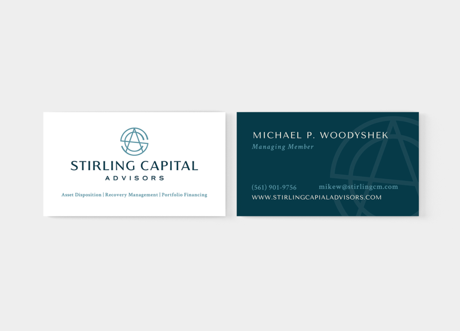
Based on the data from the interviews, I knew the primary attribute we needed to communicate was trustworthiness. Using cool colors and a more traditional-looking typeface helped create a visual sense of safety around the brand.


Now Mike’s brand has a modern presence that shows he is an active participant in his industry, armed with the experience to be a trustworthy partner for his clients.
Working with Angie on the process of revising our company’s branding, logo and image has been fantastic. Being able to get inside our clients’ heads through Angie’s interviews has been extremely valuable going forward. Pivoting our brand from being focused on what we wanted people to think of Stirling Capital to what we now know our clients are looking for when they’re researching us has been a game changer. I now feel like we have a brand that will really resonate with our market. I couldn’t be more satisfied with the work Angie did for us and recommend her services with enthusiasm.
